11Pets
A UX audit and redesign of a pet-care management app
11Pets provides valuable pet-care features, but the experience creates friction during critical moments like onboarding, pet profile creation, and daily care management. I conducted a UX audit and redesigned the app to improve onboarding, pet profile creation, daily care management, and premium feature discovery.
The problem: Users encounter unclear interactions, inconsistent branding, and premature premium barriers that reduce trust and make completing basic tasks difficult. How might we redesign 11Pets to create a more emotionally engaging pet-care experience while helping users successfully manage their pets' needs?

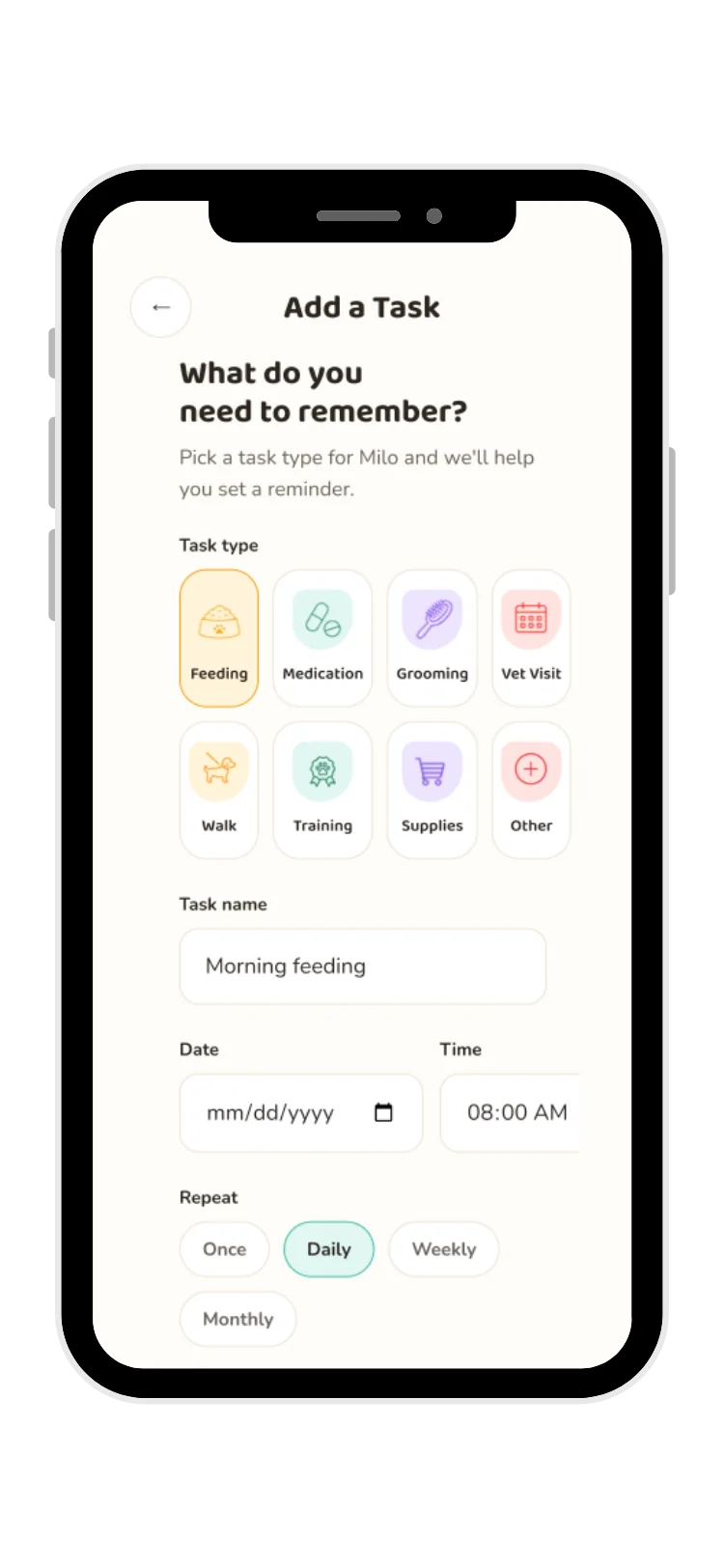
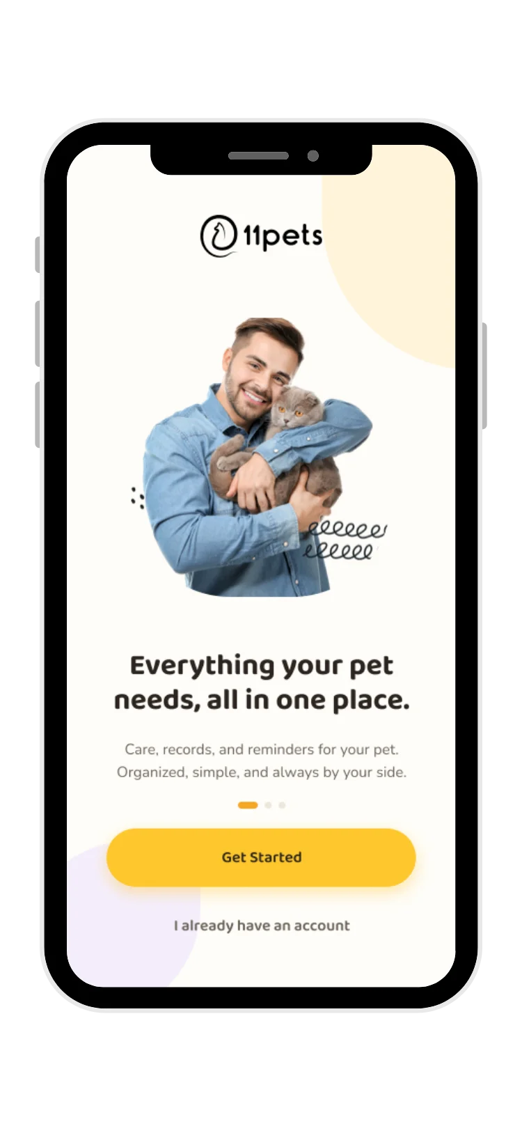
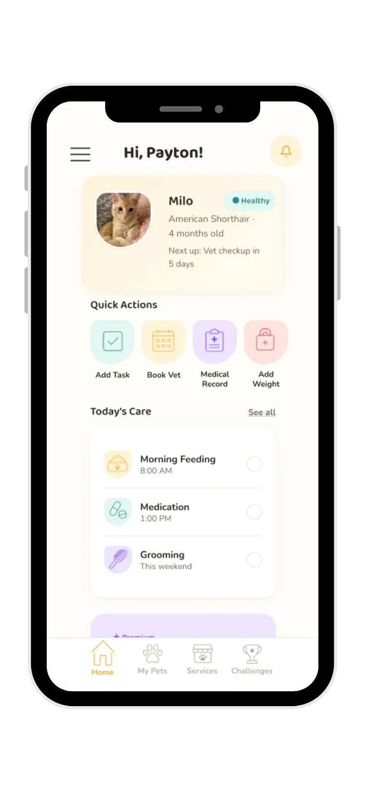
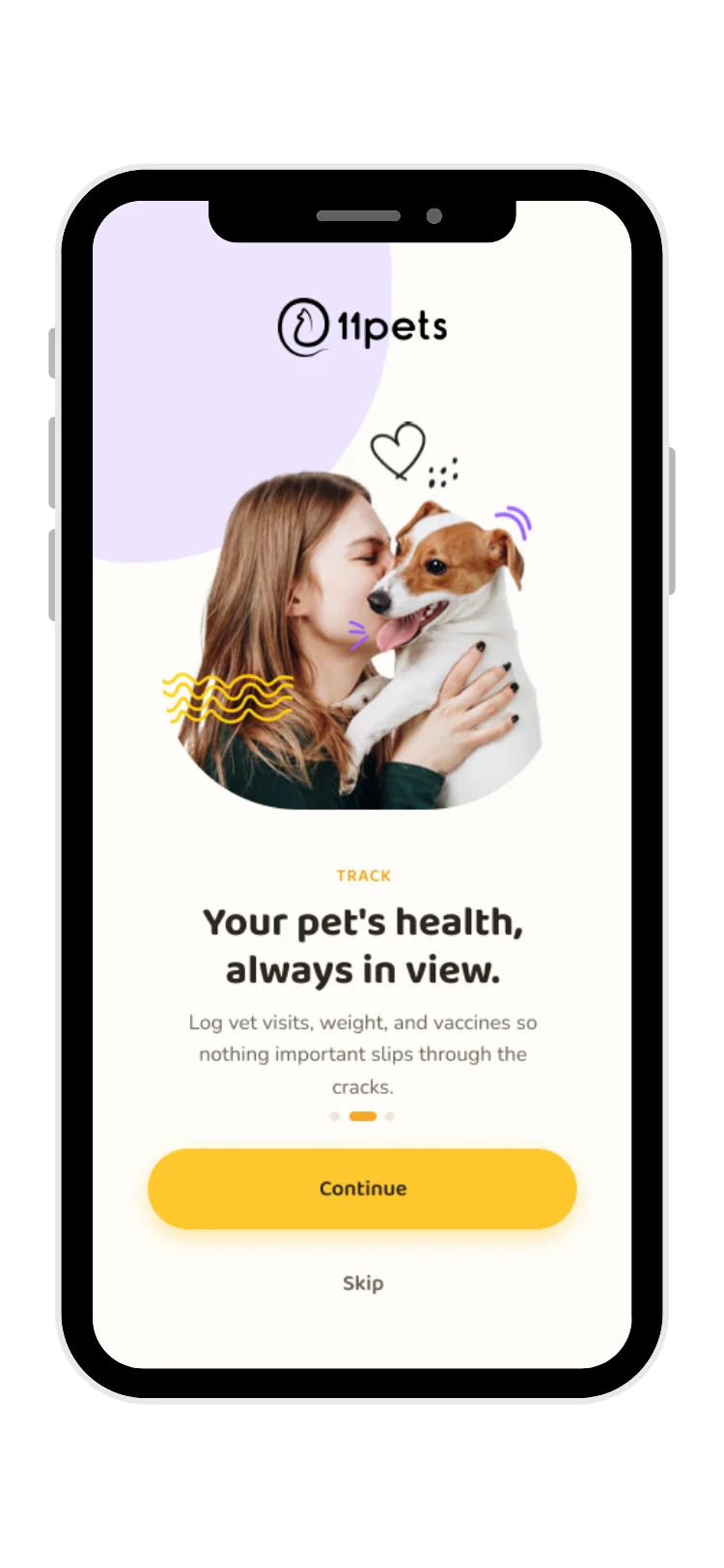
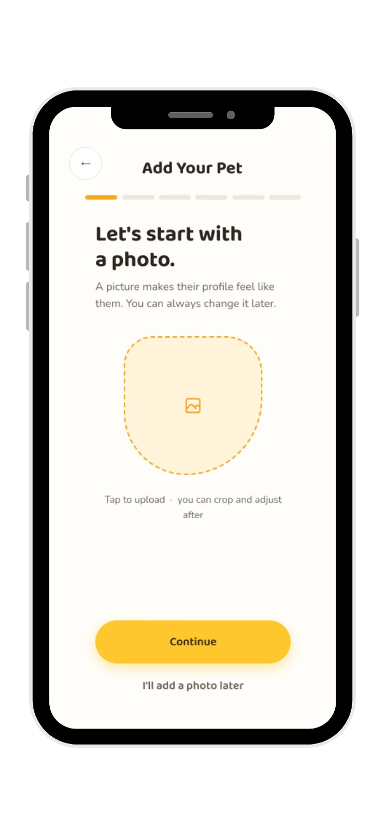
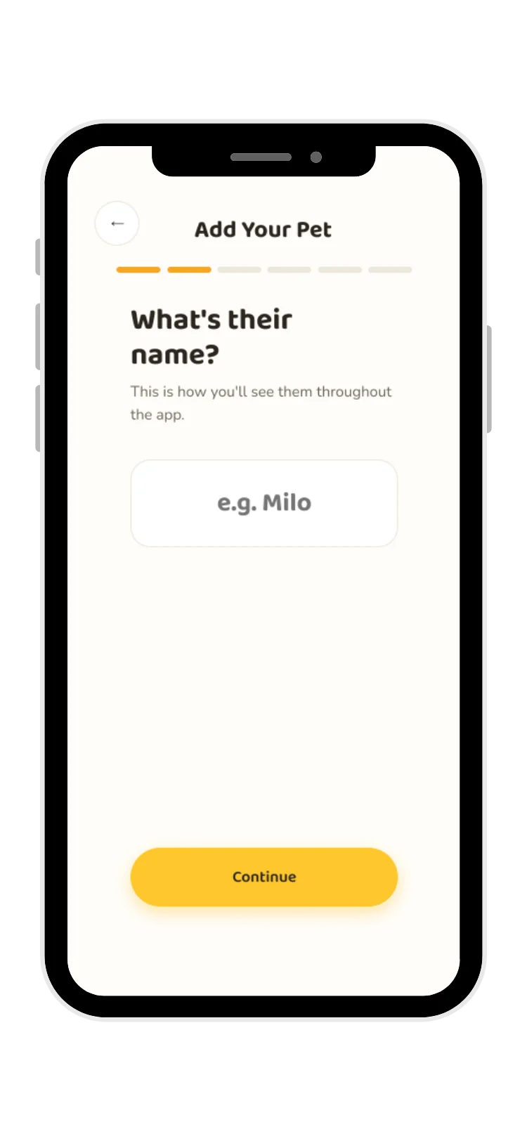
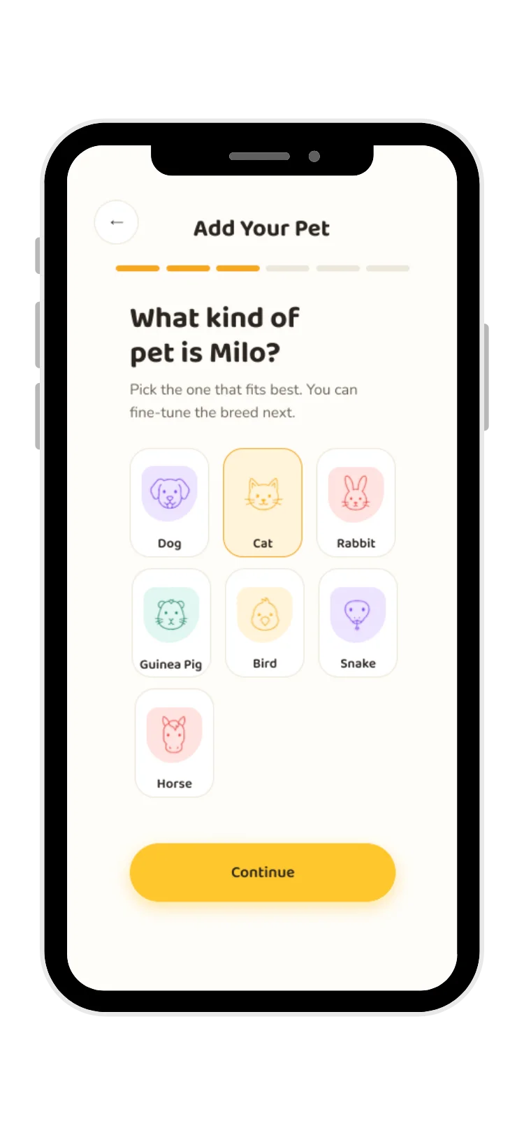
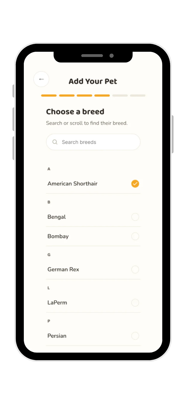
Twelve screens across the redesigned flow
Click through the high-fidelity screens covering onboarding, pet profile creation, the daily care dashboard, and premium feature discovery.
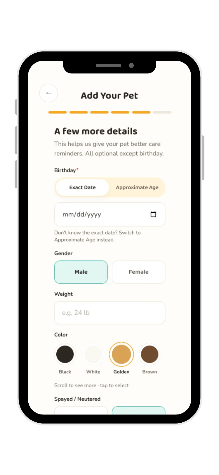
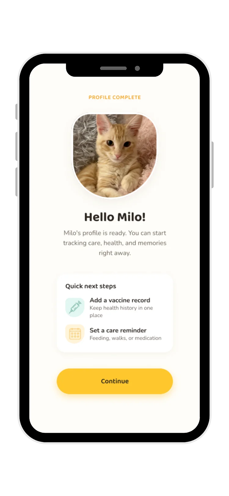
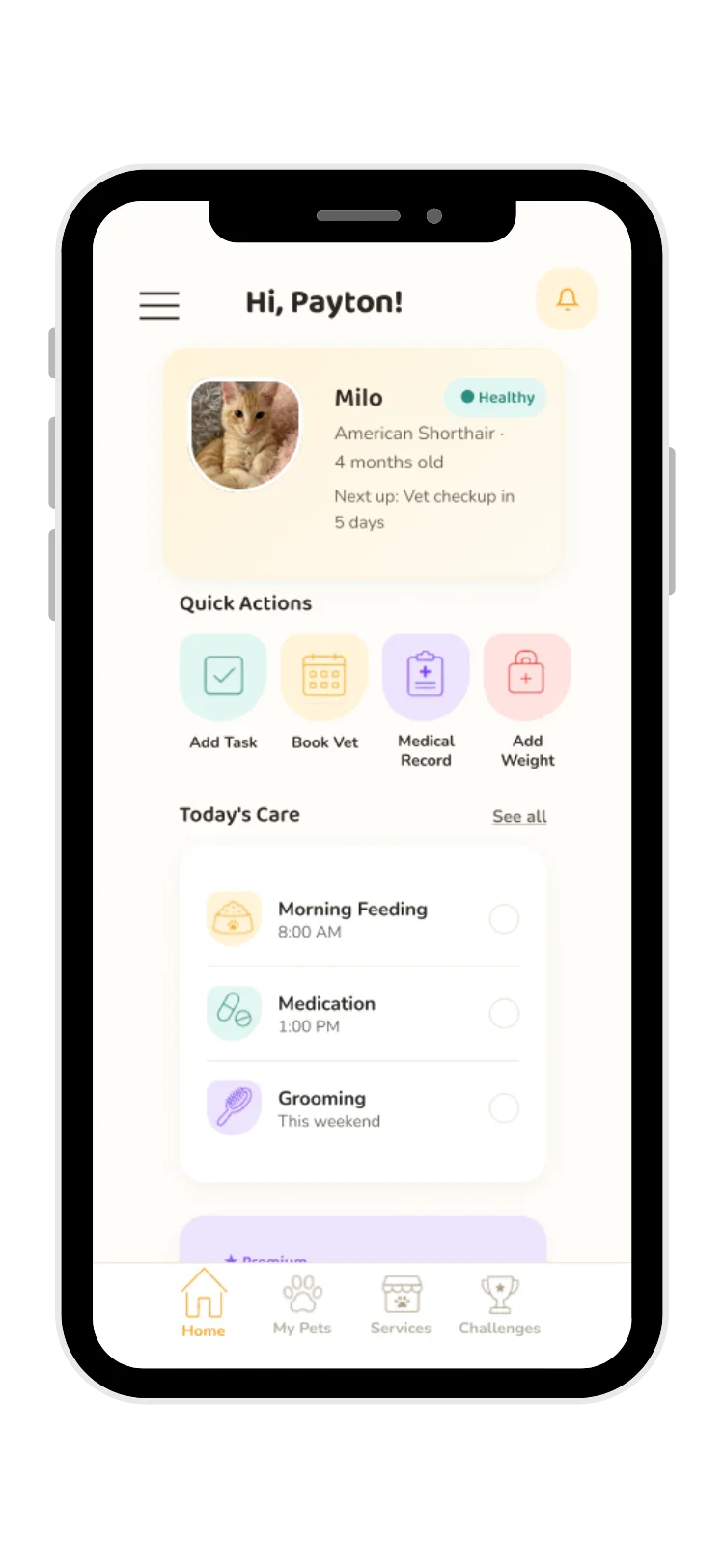
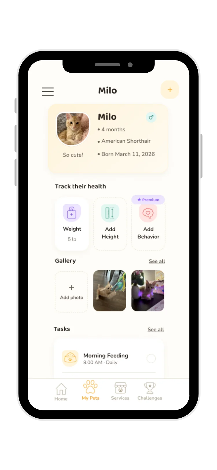
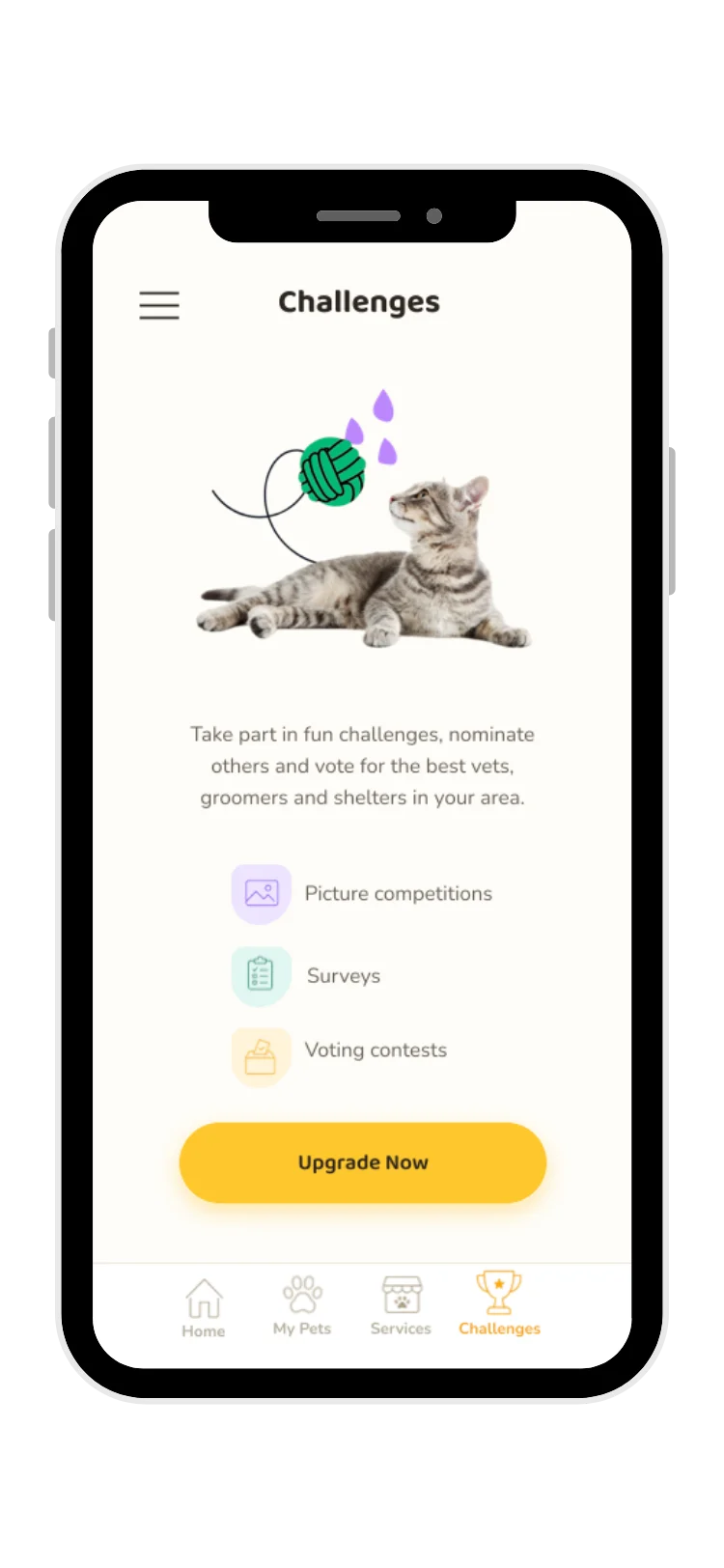

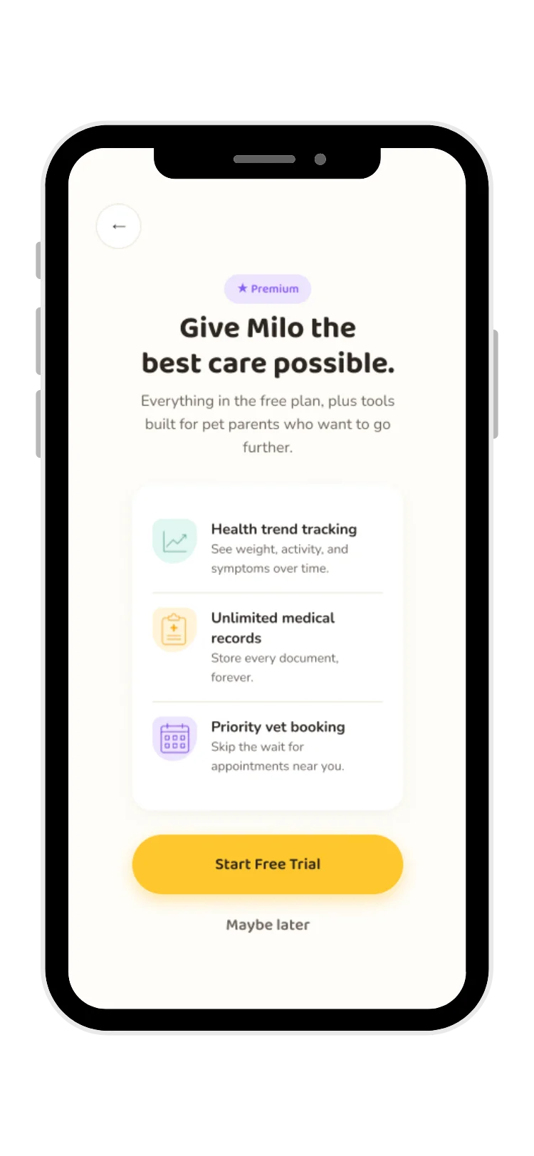
A UX audit paired with secondary research
I combined a hands-on usability audit with secondary research to identify user pain points and redesign opportunities, since I had limited access to an active user community to test with directly.
UX audit + usability evaluation:
- Competitive/product analysis — reviewed the existing 11Pets app, examining the onboarding process, pet creation, profile management, tasks, services, and premium flows.
- Usability testing — creating an account, adding a pet, completing a pet profile, creating tasks, exploring services.
- Secondary research — app reviews, public feedback, and brand/social presence.
Users are interrupted before experiencing value
Premium appears during onboarding, and profile completion requires premium — behavior and weight updates are locked behind it. Users need to build trust and understand the app's value before being asked to upgrade.
Pet setup should feel more personal
Typing colors, long lists, spelling errors, and a lack of emotional moments make the process feel like filling out a form, rather than welcoming a companion.
The app has an inconsistent visual identity
Multiple shades of purple, conflicting fonts, and inconsistent buttons. The brand has strong visual elements, but they aren't consistently applied.
Important interactions lack feedback
Photo loading, service failures, date picker issues, and keyboard problems all leave users uncertain that their actions are working.
Because the existing app had limited active community engagement, I combined a hands-on usability audit with secondary research pulled from publicly available reviews and feedback to identify pain points and redesign opportunities.
Broken health record uploads
A user managing a dog with chronic health needs reported that file uploads for veterinary records weren't functioning. Users managing pets with ongoing health needs rely heavily on accurate record storage. Opportunity: prioritize reliable document uploads, clear upload progress and confirmation, and alternative input methods.
Behavior tracking didn't match how owners think
A user reported that behavior tracking focused on human emotions rather than pet behavior patterns like appetite, energy, and activity. Opportunity: redesign behavior tracking around measurable observations — eating habits, sleep, activity, mood changes, symptoms, and routine changes.
Premium limits penalize multi-pet households
A review expressed frustration that previously available features became locked behind a subscription, especially for users with multiple pets. Opportunity: clearly communicate what premium unlocks, ensure free users experience meaningful value first, and avoid making essential pet-management tasks feel inaccessible.
When users entrust an app with their pet's health information, reliability and clarity are essential. Broken record management and unclear premium features prevent users from building trust with the product. Users rely on care trackers as part of their daily routines — restricting these tools behind unclear premium barriers creates frustration and reduces trust.
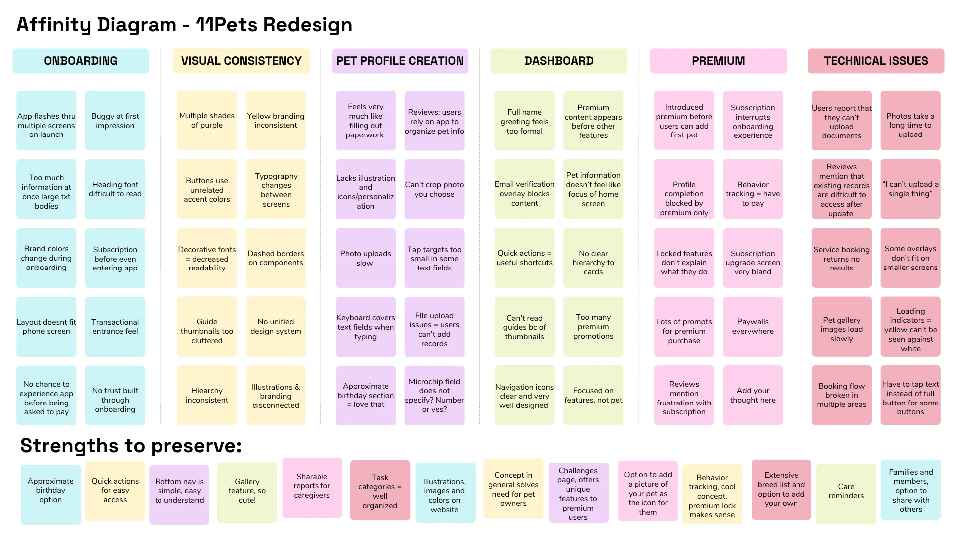
Grouping research into patterns
I organized interview notes, audit findings, and review feedback into an affinity map to surface the recurring patterns that shaped the redesign goals.
Designing around Sarah and Butterball
Sarah represents the core user I designed for: someone who wants a reliable, low-friction place to manage her pet's care without fighting complicated forms or premature subscription prompts.
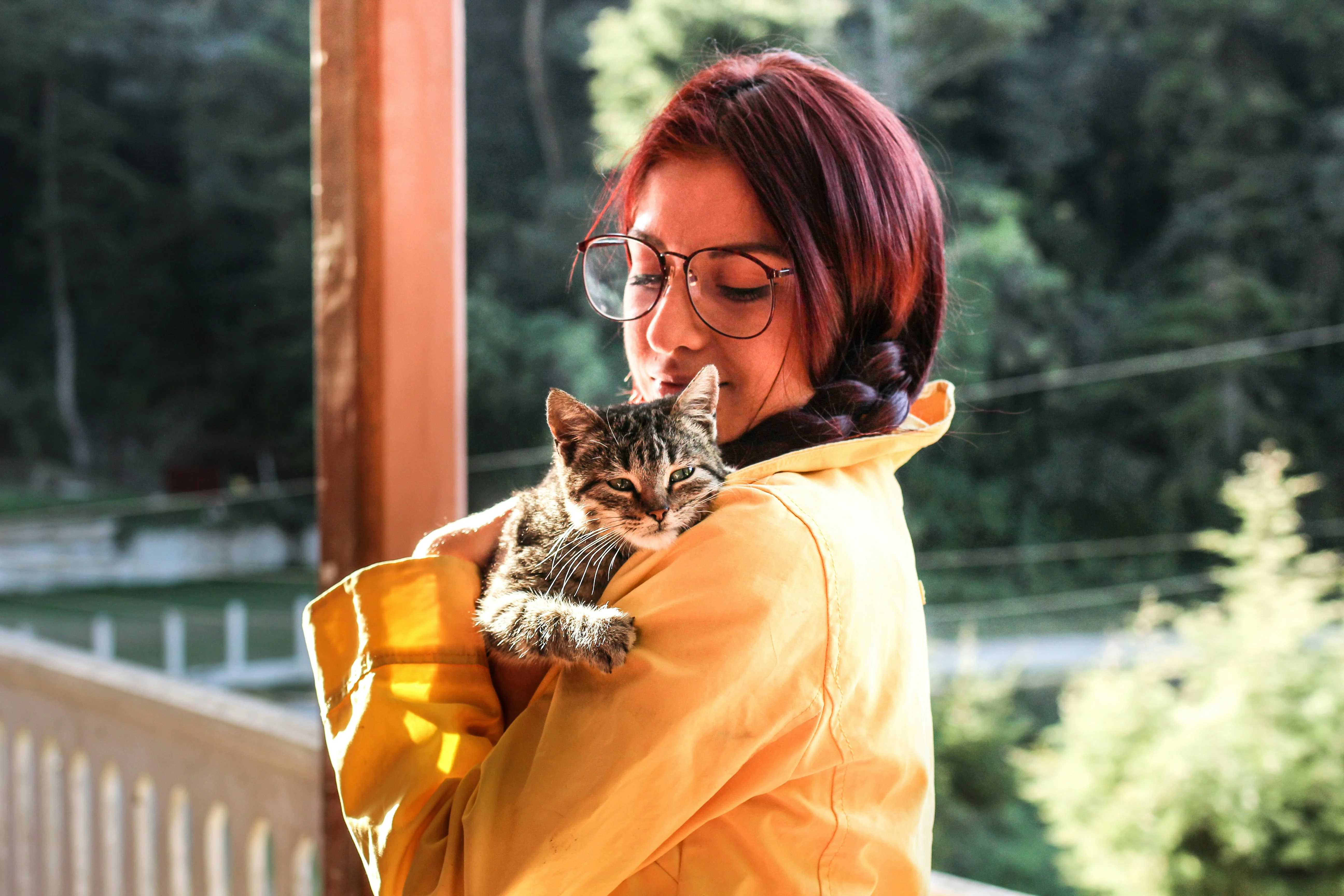
Goal: Keep all of Butterball's health records in one place and never miss a medication or checkup, without wading through complicated forms or subscription prompts.
Goals
- Keep all of Butterball's health records in one place
- Never miss medications or annual checkups
- Easily upload and organize documents from the vet
- Feel confident his info is accessible in an emergency
Frustrations
- Being asked to pay before understanding an app's value
- Long forms that take forever to complete
- Confusing or inconsistent interfaces
- Slow uploads and technical issues — she's a busy woman
Four goals driving every design decision
Create a welcoming onboarding experience
Completely revamp onboarding to fit the brand better, feel more welcoming, and prioritize helping users complete core pet-care tasks — creating an account, adding a pet — before introducing premium features.
Make pet profile creation feel personal
Adding a pet should feel more personal — long forms and limited personalization currently work against what should be an emotional moment, welcoming a new companion into the app. Transform pet setup with illustrated pet selections, improved personalization, friendlier language, and reduced friction.
Make premium features feel valuable, not restrictive
Pet owners need to trust the app before committing to premium — premium currently appears early, before users even complete sign-up, and reviews mention subscription frustration. Let users fully create their account and first pet profile before mentioning premium, introduce it only after they understand the app's value, and make locked features clearly communicate their benefit.
Build a consistent visual system
Users need consistent visual patterns to feel confident navigating — multiple colors and three shades of purple are present in the current app, alongside different button styles and inconsistent typography. Establish a consistent color palette, reusable components, and standardized buttons, cards, and typography, expanding the illustration style found in successful areas like "Challenges."
Mapping the paths that mattered most
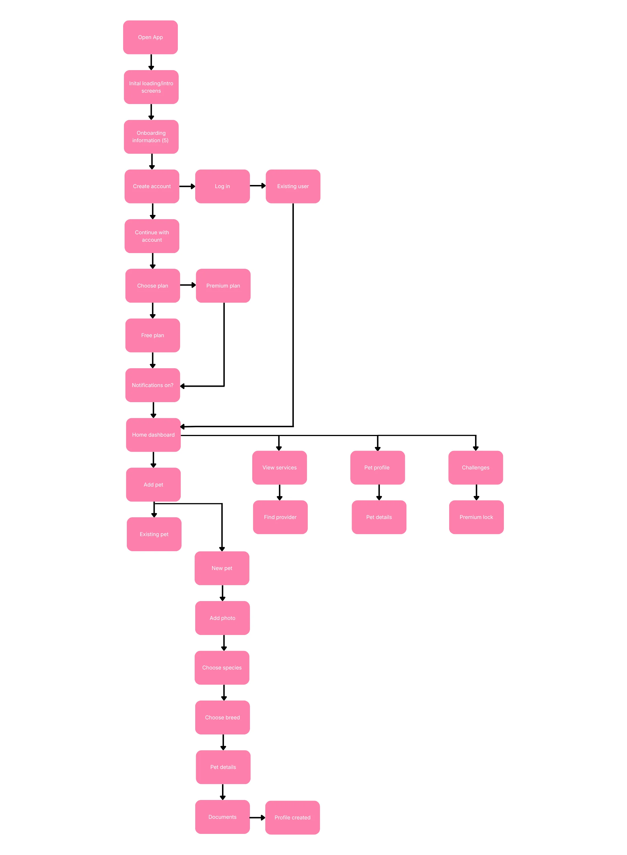
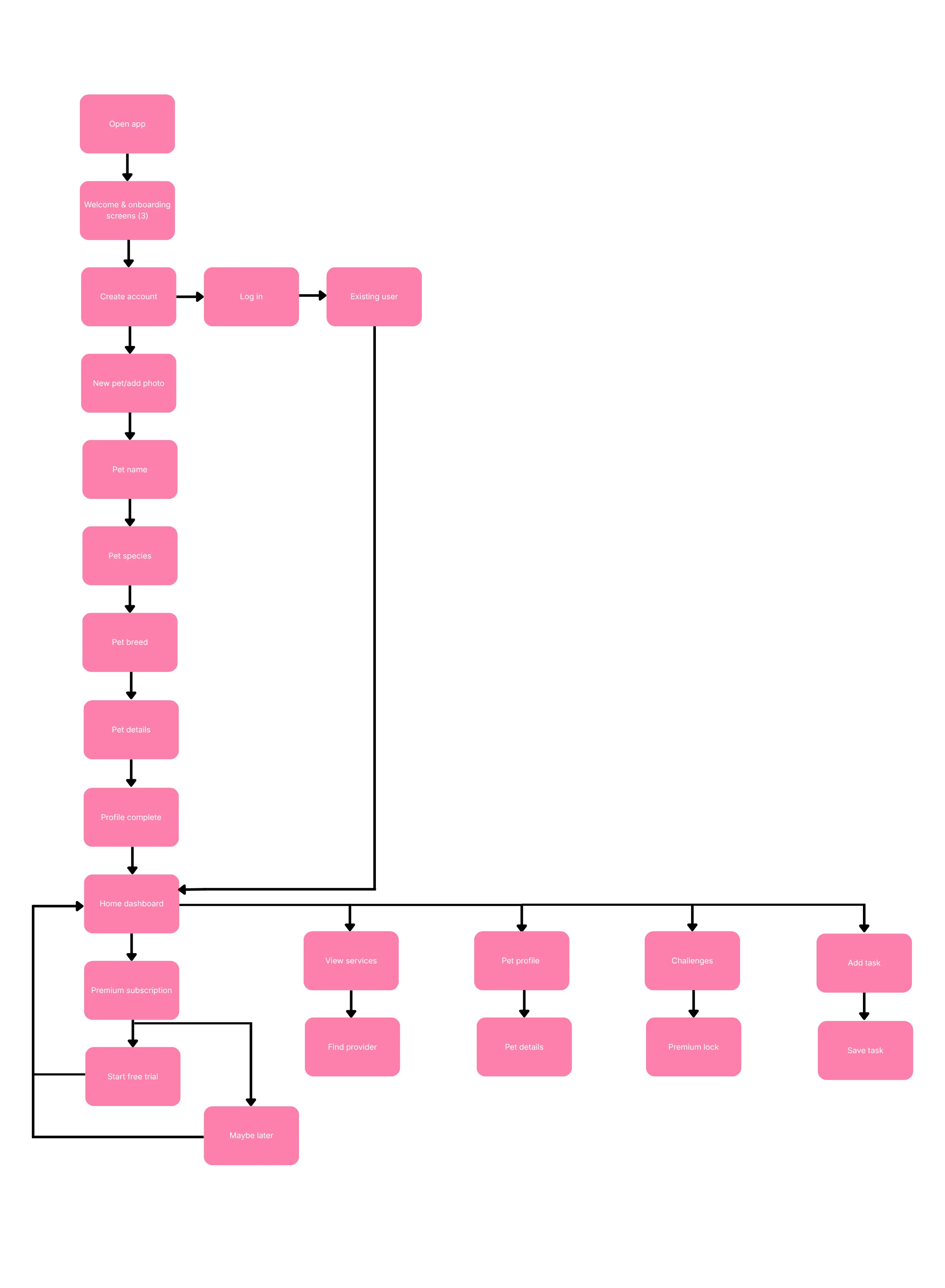
I mapped out the onboarding and pet-profile-creation flow to identify where friction and premium interruptions were breaking trust, then iterated on it to plan a smoother path through.
From paper sketches to Figma
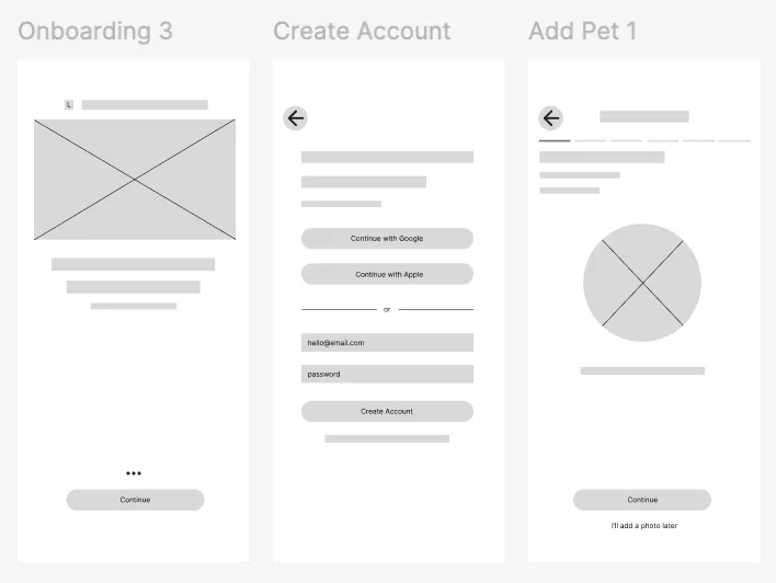
I explored layout options through paper sketches and Figma wireframes before moving into high-fidelity screens.
See it in action
You can view the prototype in Figma, or reference the high-fidelity mockups above for all screens.
View prototype in FigmaComing soon
Usability testing on the redesigned flows hasn't been conducted yet — this section will be updated once that round of testing is complete.
Coming soon
Reflection and impact notes will be added once usability testing and iteration on this redesign are complete.
More projects
Take a look at the rest of the work, or get in touch if you want to talk through this one further.