Calhoun-Bouchey Artistry & Frames
I designed a full brand identity and website for a client who had no existing website, logo, or online presence at all. Unlike a typical UX project, this one started at the very beginning: sketching logo concepts in Procreate before a single screen was designed. The site is now live at lcbartistry.com.
Turning a business into its first digital presence
The client required a professionally styled website that would showcase what goods and services they offered. Without a website or structure present, everything related to the presentation of the client's brand had to be developed from scratch.
The aim was to develop something that would look professional and trustworthy while being easy to maintain for the client moving forward.
Visitors and client requirements
- Potential customers had to have an understanding of the services provided by the client, and a clear way to get in touch.
- The client needed a website they could update and manage on their own without needing ongoing developer support.
Starting from a blank slate: the logo first
This project didn't start with wireframes, it started in Procreate. The client had no existing logo, so before I designed a single screen, I sketched out logo concepts digitally, exploring a framed botanical mark that tied back to the "artistry and frames" of the business name.
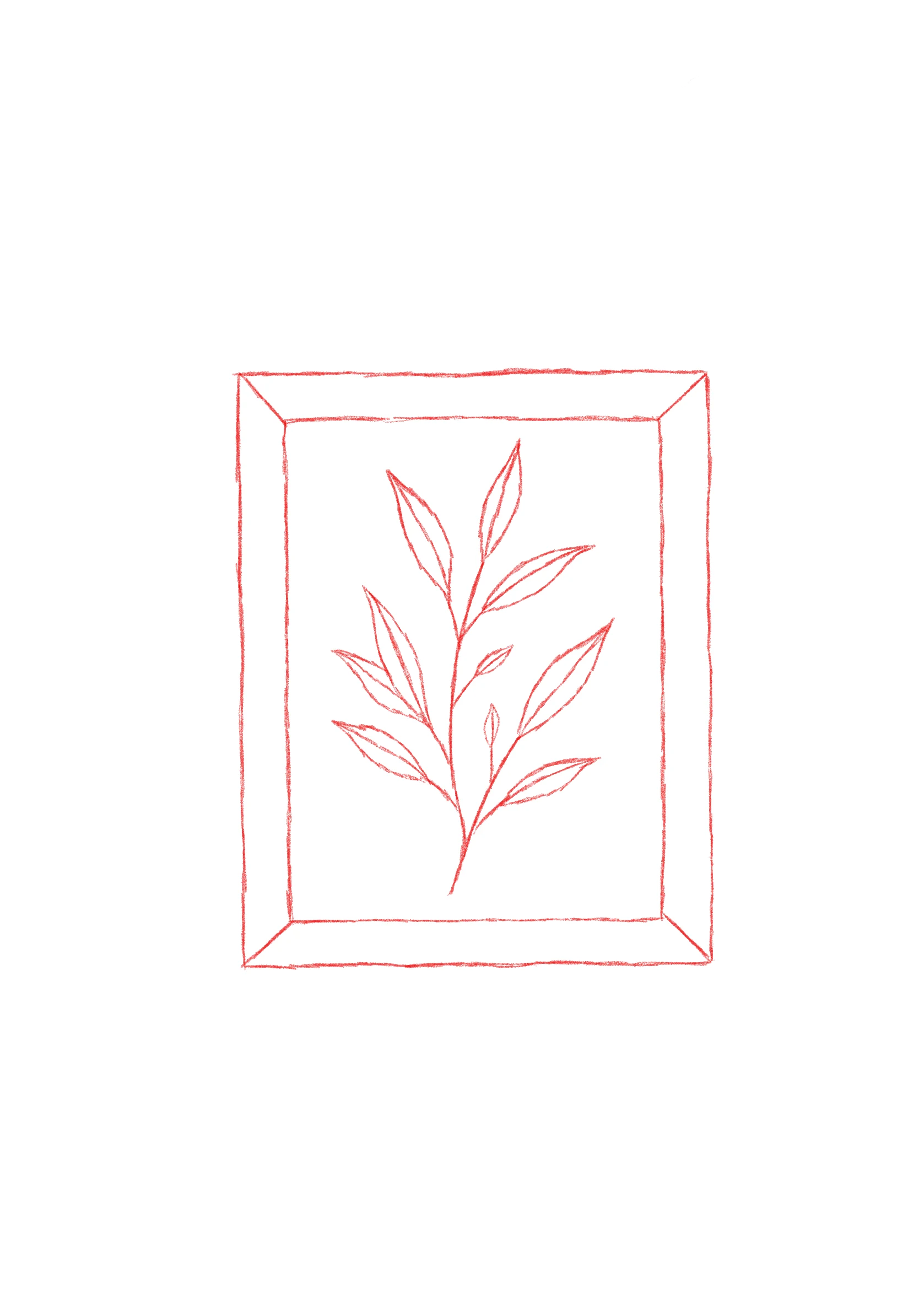 First pass — a single framed branch
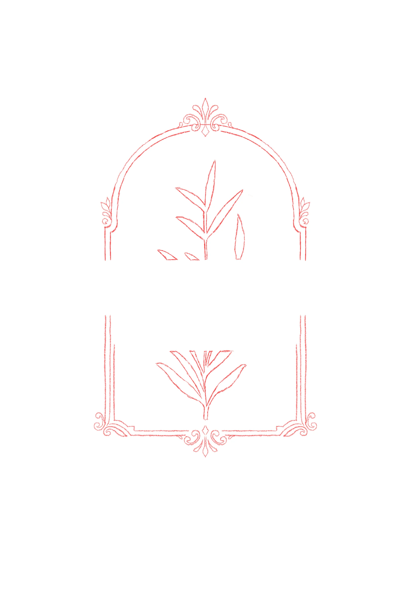 Refining the frame — ornate arch and scrollwork
From there I developed the concept into two polished directions and brought both to the client to compare side by side.
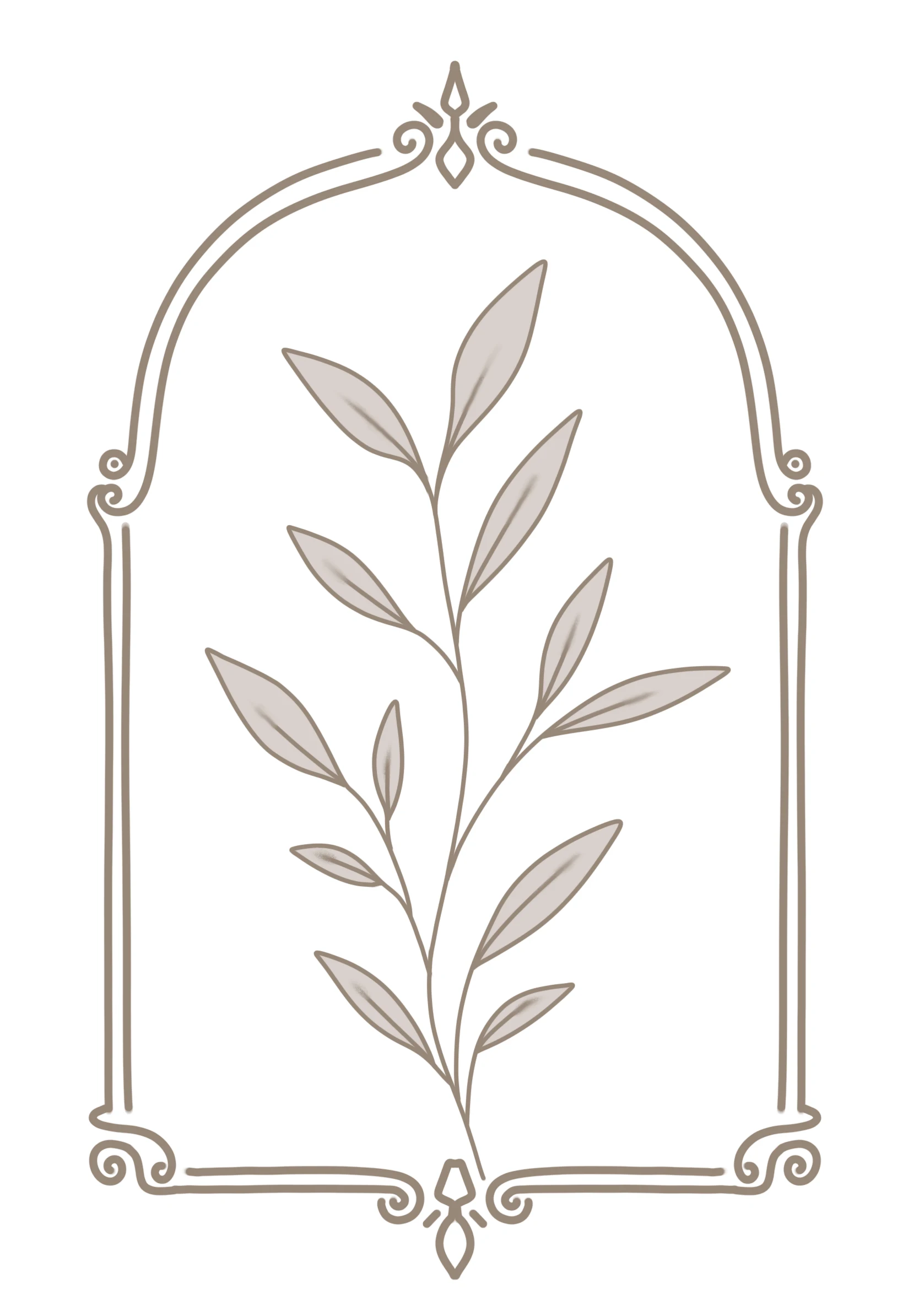 Direction A — not chosen
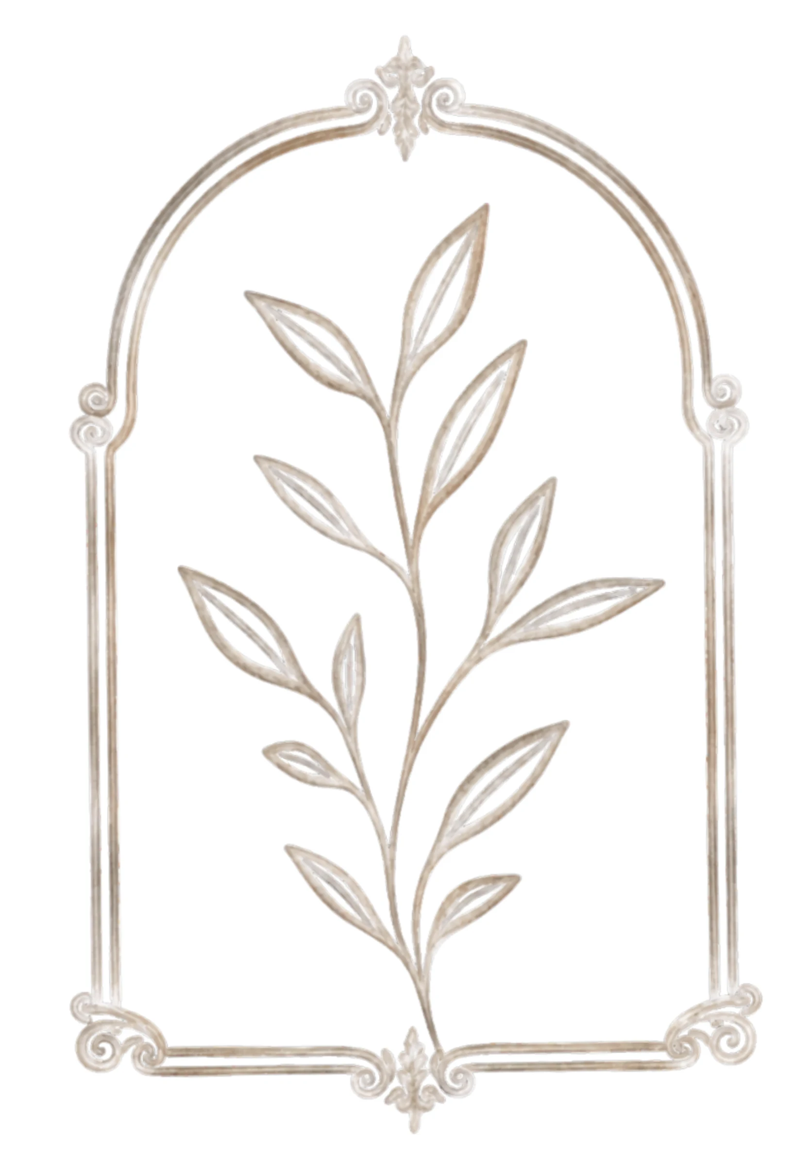 Direction B — chosen
The favicon got its own exploration rather than just shrinking the full icon down. I sketched a "CB" monogram (for Calhoun-Bouchey) in Procreate, woven through with the same branch motif, then carried it into color for the final mark used across browser tabs and social profiles.
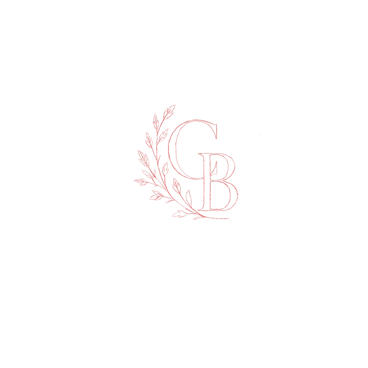 Monogram sketch
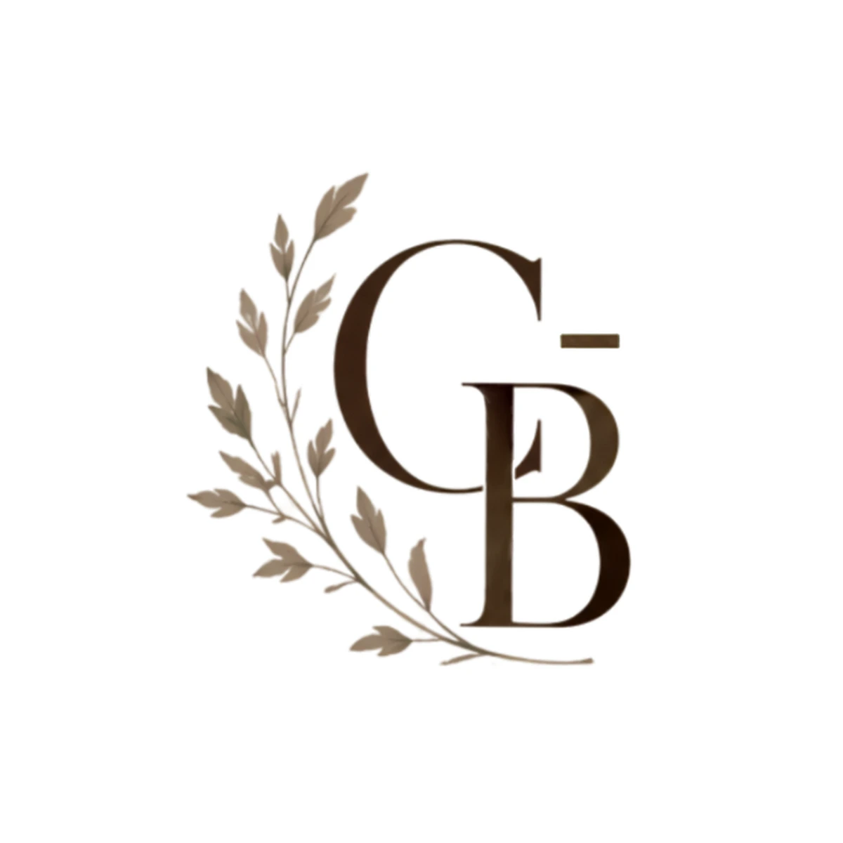 Final favicon
The chosen icon then became the centerpiece of the full logo lockup, paired with a serif wordmark for the primary business name and a lighter, spaced-out line for the secondary tagline.
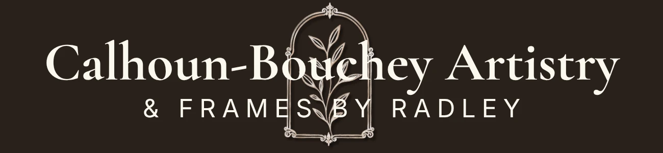
- Typography — A serif wordmark for warmth and craft, paired with a lighter, spaced-out sans for the secondary line so the two don't compete.
- Visual mood — Warm and earthy tones throughout, reflecting the handcrafted nature of the client's products and work.
- Consistency — The same botanical mark carries from the full logo, to the favicon, to accents across the site, so nothing feels like it was designed separately.
Building a layout from borrowed inspiration
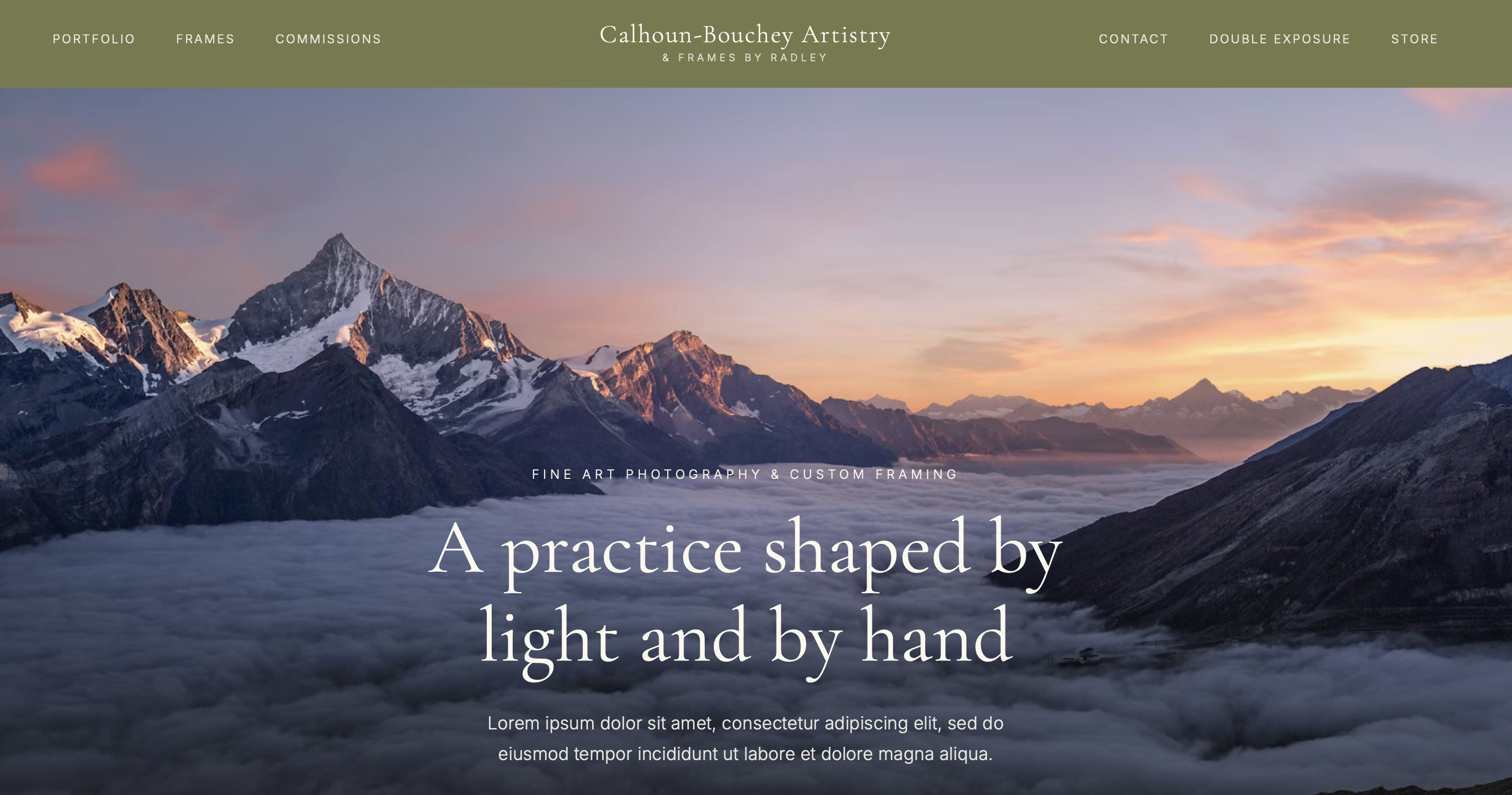
With the brand identity settled, the client sent over a handful of other artists' portfolio sites she liked as references. Rather than copy any single one, I picked out the specific elements that were actually working, a large hero photograph and a sticky navigation bar that stayed put while scrolling, and combined those with layout and structural decisions of my own to build something cohesive rather than a patchwork of borrowed parts.
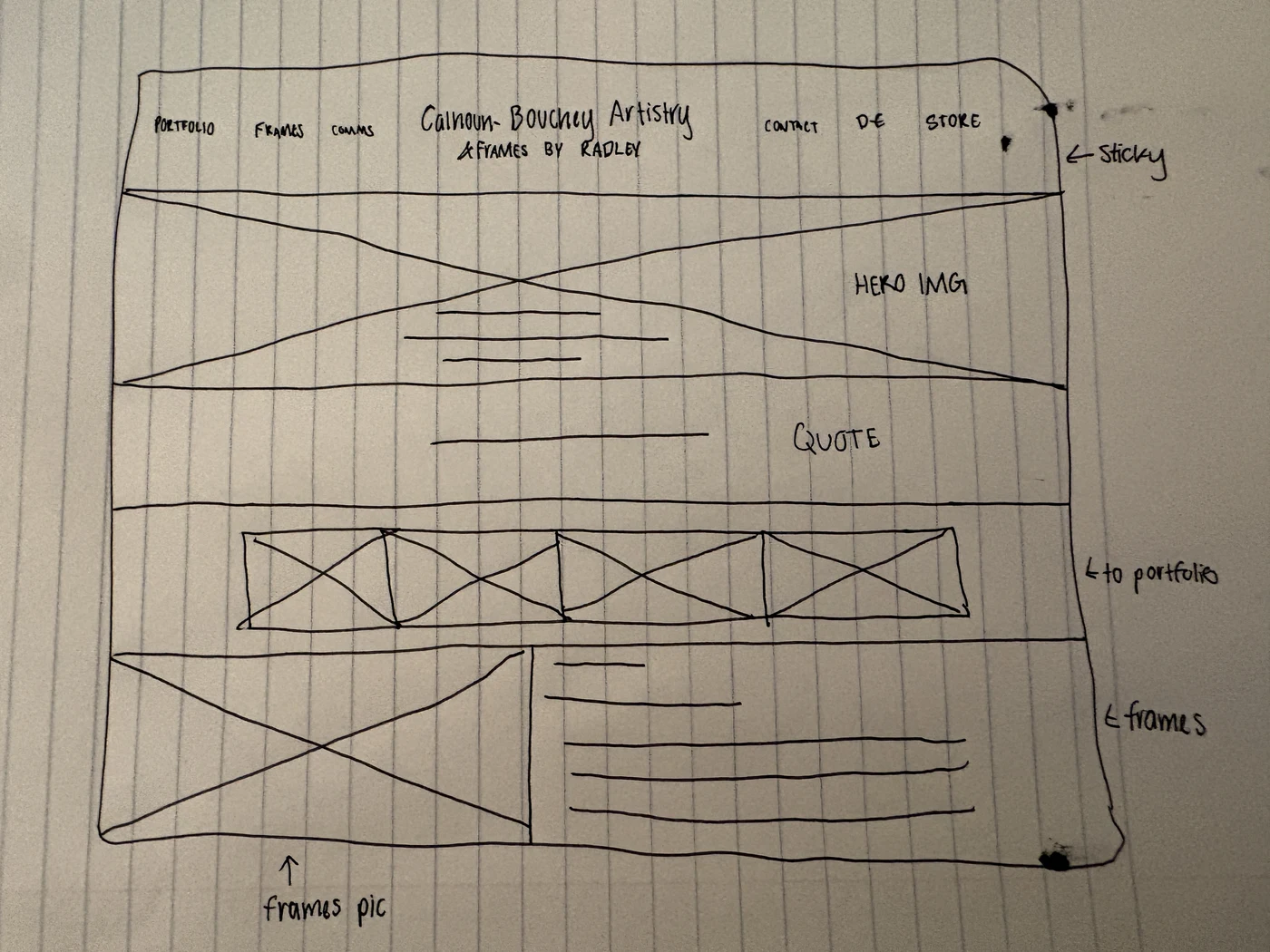
A site the client can actually use and maintain
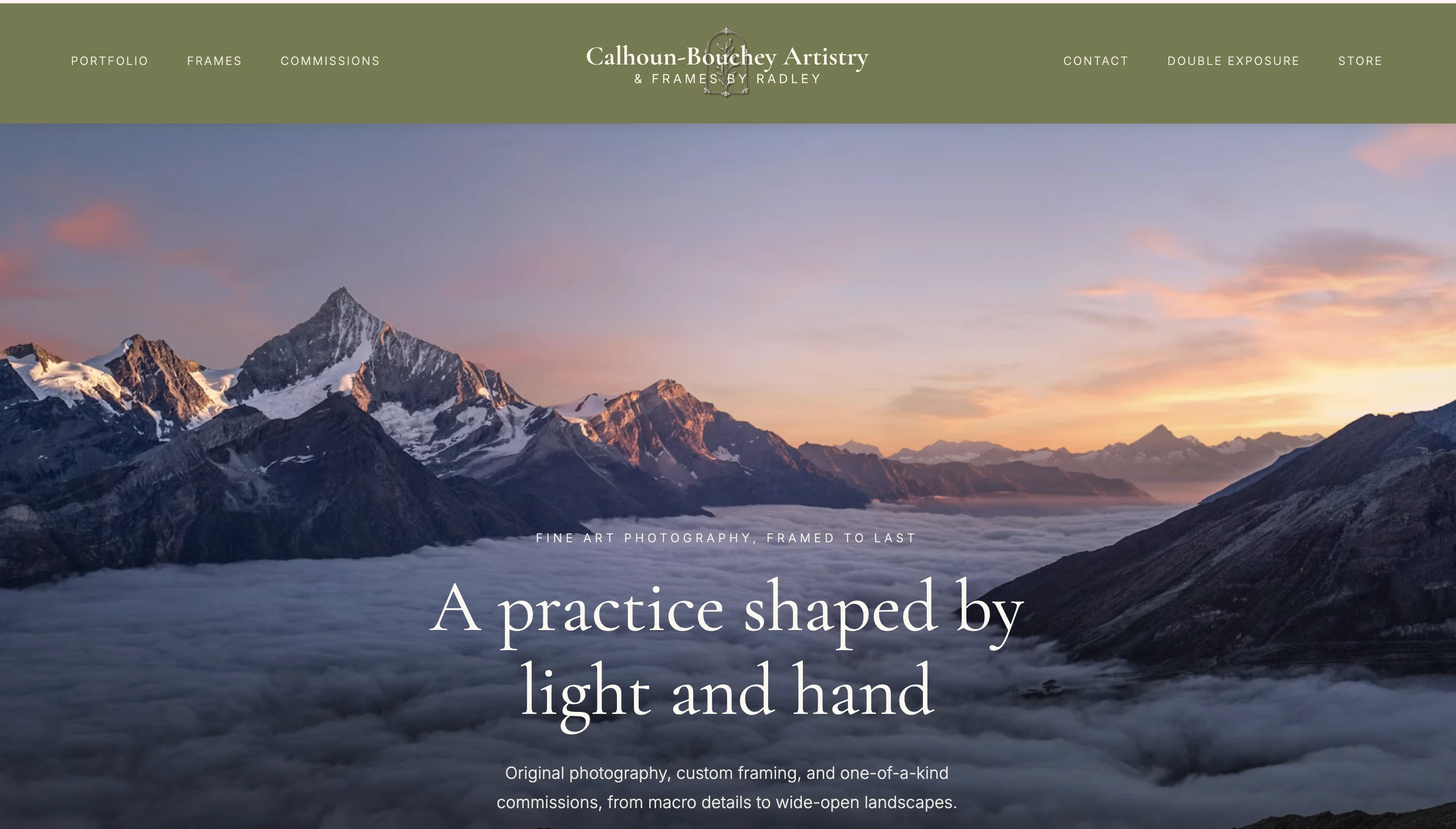
The site launched and is live at lcbartistry.com, built on Astro with a custom Sanity CMS dashboard so the client can update it herself going forward without needing ongoing developer support. Every field in the dashboard is clearly labeled so she can make edits easily, and changes get pushed live through GitHub.
Any visitor can see the client's services, learn about what's offered, and reach out directly, all from a brand and a site that didn't exist before this project. The mobile experience was treated as a first-class version of the site, not an afterthought, since most visitors are likely to visit it via their mobile device.
What this project reinforced
This project showed how vital it is to have clear structures while working on products for people who do not have a digital identity yet. Even small choices regarding navigation and hierarchy affect the usability of the app, particularly for mobile devices.
Starting from a hand-sketched logo in Procreate instead of a template also reinforced how much groundwork happens before a screen ever gets designed. Taking a client all the way from "no online presence at all" to a live, self-manageable site was a different kind of project than redesigning an existing product, and it's the one I'm proudest of seeing through to an actual launch.
More work
See more projects or get in touch if you'd like to talk about this one.